Android Elevation and shadows Z軸高度與陰影
Android Material Design 中為了讓使用者更專注於某物件, 因此使用了3D空間的Z軸與陰影, 讓整體設計更具有立體感.
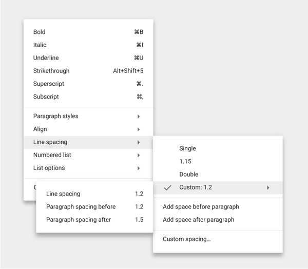
由上圖來看, 每個Menu與Sub-Menu之間有各自的高度與陰影, 使其畫面看起來具有立體感, 並且專注於最高層的Sub-Sub-Menu.
Android 官方對於不同物件之間規定不同的層級, 且對於Pressed和Normal狀態也有特殊規定.
| Elevation (dp) | Component |
|---|---|
| 24 | Dialog, Picker |
| 16 | Nav drawer, Right drawer, Modal bottom Sheet |
| 12 | Floating action button (FAB - pressed) |
| 9 | Sub menu (+1dp for each sub menu) |
| 8 | Bottom navigation bar, Menu, Card (when picked up), Raised button (pressed state) |
| 6 | Floating action button (FAB - resting elevation), Snackbar |
| 4 | App Bar |
| 3 | Refresh indicator, Quick entry / Search bar (scrolled state) |
| 2 | Card (resting elevation) , Raised button (resting elevation), Quick entry / Search bar (resting elevation) |
| 1 | Switch |
App bar : 4dp

Raised button
Resting state: 2dp
Pressed state: 8dp
For desktop only, raised buttons can have an elevation of:
Resting state: 0dp
Pressed state: 2dp
Floating action button (FAB)
Resting state: 6dp
Pressed state: 12dp

Card
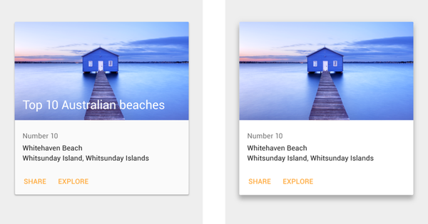
Resting state: 2dp
Pressed state: 8dp
On desktop, cards can have a resting elevation of 0dp and gain an elevation of 8dp on hover.
Menus and sub menus
Menus: 8dp
Sub menus: 9dp (+1 dp for each sub menu)

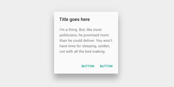
Dialogs : 24dp
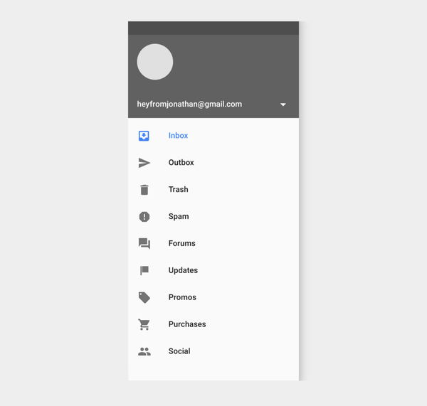
Nav Drawer & Right drawer : 16dp
Modal bottom sheet : 16dp
Refresh indicator : 3dp

Quick entry/Search bar
Resting state: 2dp
Scrolled state: 3dp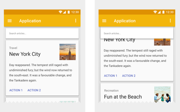
Snackbar : 6dp

Switch : 1dp

Android Elevation and shadows Z軸高度與陰影
https://nickcarter9.github.io/2016/05/25/2016/2016_05_25-android-elevation_shadows/